Moo Author Business Cards
I was going to title this “New Author Business Cards,” but my lame sense of humor took over. (I’m not known for being witty, although I frequently crack myself up.)
Why “Moo?” Because I used Moo instead of Vistaprint this time. See? It’s funny. Kind of.
Mooving on.
My last author business cards were nice, but I had 4 reasons for making new ones.
1: My author photo came out too pale last time.
2: I’ve finally started to figure out cross-platform branding, and I wanted my cards to reflect that.
3: I’ve since updated my author headshots.
4: I was unhappy with the pre-configured layouts in Vistaprint. Example A: With both of my past cards I met other authors and small business owners using the same layout. Not good.
Combining these points, I knew I had to change my cards before attending writing conferences this summer.
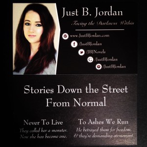
For reference, here is my old author business card displayed in poor lighting:
I knew exactly what I wanted my new cards to look like: Images, colors, fonts, even the layout. I tried to use Vistaprint. It gave me a headache. Their layouts just wouldn’t work with what I wanted.
I was about to post in FB groups to hire a graphic designer to format the design.
Then I checked out Moo. They allowed me to take images from my computer and upload them to both the front and back of the card, and they didn’t show up stretched or grainy.
It took a lot of finagling. I had to bounce from Canva to layer my images, to PicMonkey for text, then check size and positioning in Moo. I did that about seven times. (Can you tell I’m not tech-savy? I’m sure someone out there is laughing at my process. It’s okay; I’m laughing too.)
Even with all that jumping around I was much happier working in Moo than in Vistaprint (at least for these specific cards).
And the bonus? Not only did the cards come in snazzy little boxes, they were thick, felt high quality, and were nearly mirror images of what was displayed on my computer screen. Yes, my headshot came out slightly grainy even though I had it at 300dpi, and my skin looks almost sunburned, but I’ll take it.
This is the author business card I wanted, and I will be proud to hand it to other professionals.
(Again, ignore the poor lighting. My photography could use some work.)
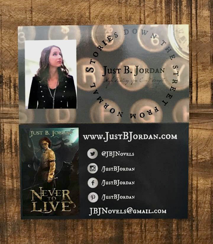
Did you notice that the cards match my website’s Home Page and my social media banners? :D The color on the back of the card is even the same as the grey at the top of this page!
What do you think? Better than my last batch of business cards?
Just B. Jordan is an award-winning author of fantasy and sci-fi. She graduated high school a year early and received her first publishing contract at the age of 18. To Ashes We Run is her most recent novel. Find it here.
Leave a Reply